Choosing the Right Upholstery Colors for Your Restaurant Seating
The Psychology of Color in Dining Spaces
It’s easy to get lost in the endless swatches of reds, blues, and neutrals when you are flipping through sample books. I’ve seen it happen a hundred times right here in our Van Nuys workshop. A restaurant owner comes in with a very specific, trendy color in mind, maybe something they saw on Pinterest or in a high-end design magazine. But before we even start cutting fabric or ordering leather, we always stop to ask: “What feeling are you trying to create?”
Color isn’t just decoration; it is a tool that directly influences how hungry your customers feel, how long they stay, and even how much they spend. For example, there is a reason why so many fast-food chains lean heavily on red and yellow. Those high-energy colors stimulate appetite but also create a sense of urgency, encouraging a faster turnover rate.
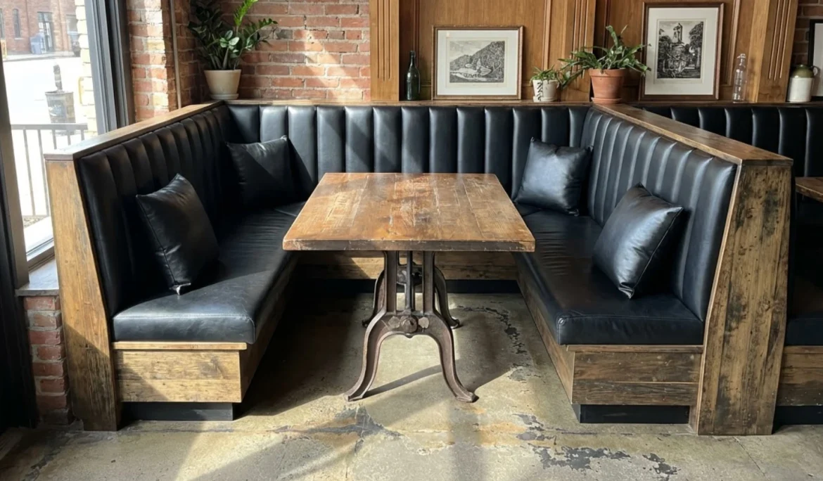
On the other hand, if you are running a fine dining establishment or a moody late-night lounge in downtown LA, bright yellow vinyl booths are going to clash horribly with the relaxed, intimate vibe you need. Darker, cooler tones like deep navy, charcoal, or forest green tend to encourage customers to settle in, order another glass of wine, and stay for dessert. We recently reupholstered a series of banquettes for a steakhouse using a very deep oxblood leather, and the immediate feedback was that the room felt warmer and more expensive just by shifting away from a generic brown.
Handling the Los Angeles Grime Factor
Let’s be realistic about what happens in a restaurant. People spill wine, kids drop ketchup, and denim jeans transfer dye onto seats. When we talk about custom upholstery for commercial spaces, we aren’t just talking about what looks good on opening night; we are talking about what looks good six months later after a thousand people have sat there.
Light colors are incredibly risky for seat cushions. While a creamy white or light beige tufted booth looks stunning and clean, it is a nightmare to maintain in a high-traffic area. Unless you have a dedicated staff wiping down seats every hour with specialized cleaners, those light colors will start to show “paths” of gray dirt very quickly.
If you are dead set on a lighter palette to keep your space feeling airy, consider a two-tone approach. We often recommend using a darker, more forgiving color for the seat—the part that takes the most abuse—and saving that beautiful cream or light gray for the inside back or the top of the booth where it’s less likely to encounter spills or blue jean dye transfer.
Texture Can Change the Color Perception
One detail that often gets overlooked is how texture influences color. A flat, matte vinyl in navy blue looks completely different from a crushed velvet or a textured woven fabric in the exact same shade.
Textures catch light differently. In a dimly lit bar, a flat material might disappear into the shadows, making the furniture look like a black void. However, a textured fabric with a bit of sheen or a complex weave will catch the ambient light, adding dimension and richness to the color.
When we create custom restaurant booths, we try to look at the fabric samples under the lighting conditions of your actual space. The fluorescent lights of our workshop are very different from the warm, dim sconces of a romantic bistro. If you can, bring a sample of your restaurant’s flooring or paint color when you visit us. Seeing the upholstery material next to the actual elements of your interior is the only way to ensure the undertones match.
Branding vs. Environment
There is a delicate balance between reinforcing your brand and overwhelming your customers. Just because your logo is bright orange doesn’t mean your entire dining room needs to be upholstered in bright orange vinyl. That can lead to visual fatigue.
Instead, think of your brand colors as accents. Maybe the main body of the booth is a neutral charcoal or a rich chocolate brown, but we add a custom welt cord (piping) or topstitching in your brand’s signature orange. This is the beauty of custom handmade furniture; we aren’t limited to what comes out of a box. We can inject your brand identity into the furniture in subtle, sophisticated ways that feel intentional rather than loud.
We worked with a café owner recently who wanted to incorporate their signature teal color. Rather than doing full teal chairs, which felt a bit like a cafeteria, we did a beautiful sandy beige textured vinyl for the main upholstery and used the teal for the buttons on the tufting. It popped, it was memorable, and it didn’t scream at the customers.
Material Durability and Color Retention
Not all fabrics hold color the same way over time. If your restaurant has large windows facing the California sun, UV fading is a genuine concern. Natural fibers like cotton or linen, while beautiful, are notorious for fading when exposed to direct sunlight. You might start with a vibrant red and end up with a dusty pink a year later.
For sunny spots, especially in patio seating or window booths, we almost always steer clients toward solution-dyed acrylics or high-grade commercial vinyls with UV inhibitors. These materials lock the color into the fiber itself rather than just coating the outside, meaning your patio cushions will look just as vibrant in October as they did in May.
Commercial spaces generally require materials with high “double rubs” ratings (a measure of abrasion resistance). But durability isn’t just about not tearing; it’s about holding that pigment. When we discuss your project, we will look at the technical specs of the fabric to ensure the color you fall in love with is the color you keep.
Trending Palettes in LOCAL Hospitality
Living and working in Van Nuys giving us a front-row seat to the trends sweeping across Los Angeles. Lately, we have been seeing a massive shift away from the industrial “reclaimed wood and metal” look toward softer, more comfortable maximalism.
Warm Earth Tones: The sterile grays of the last decade are warming up. We are stitching a lot of terracottas, warm ochres, and olive greens. These colors feel organic and grounding, which pairs well with the farm-to-table menus that are so popular right now.
Jewel Tones for Nightlife: Bars and lounges are embracing opulence. Sapphire blue, emerald green, and even deep amethyst purple are popular choices, especially in velvet or mohair-style fabrics. These colors hide stains remarkably well while giving the space a luxurious, VIP feel.
The New Neutrals: While gray is fading, “greige” (gray-beige) and taupe are strong. They offer the versatility of a neutral but with enough warmth to prevent the space from feeling cold. These are excellent workhorse colors for family restaurants where functionality is key, but style is still required.
Don’t Ignore the “Ewww” Factor
This might be a bit blunt, but it’s practical advice from someone who strips old furniture for a living: consider what certain colors look like when they are dirty. Medium-toned patterns are the absolute best for hiding crumbs and minor spots until the busboy can get to them.
Solid colors are unforgiving. A solid black seat shows every speck of dust and every crumb of bread. A solid white seat shows every drop of coffee. A heathered weave, a distressed leather look, or a subtle geometric pattern breaks up the visual field. It allows the furniture to look cleaner for longer during a busy Friday night rush.
Customization is Key to Longevity
Ultimately, the “best” color is the one that fits your specific operational needs and aesthetic vision. Because we build everything from scratch or reupholster existing frames, we aren’t trying to sell you on the one color we have in stock. We want to find the solution that makes your business look professional for years to come.
If you are unsure where to start, looking at your menu and your lighting is usually the first step. A burger joint has different upholstery needs than a sushi bar. If you are local to the Los Angeles area, or even if you are planning a renovation from further away, we are always happy to look at photos of your space, or better yet, have you come by the shop to touch the materials yourself. There is no substitute for holding the leather or fabric in your hand to see the true depth of the color.
We can mix and match materials, create custom shapes to fit odd corners of your building, and ensure the foam density is correct for the type of dining experience you offer. The color is just the final layer of a very thoughtful process.